Charts
SELECT 0,1,2,3,4,5,6,7,8; result can look like this
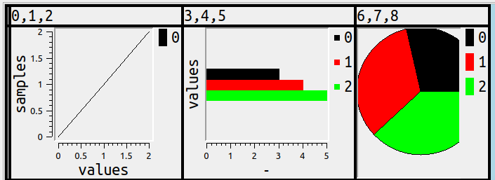
but should it?
I’ll try to cover here what would be an obvious way to show number columns in charts, or if not obvious then at least simple, or if not obvious or simple then at least understandable, or if none of the above, well, good looking.
The initial part of this description will look a bit like what you see with DB2 magic commands for bar or line or pie charts, but I like to think the later part of this description shows something more sophisticated.
Bars
Start with the most obvious: any group of numbers can be shown as a group of bars.
Should they be horizontal by default? That appears to be the less common choice, A Complete Guide to Bar Charts says “While the vertical bar chart is usually the default …”, ChartJs says “The default for this property is ‘x’ and thus will show vertical bars.”
But a SAS blog 3 reasons to prefer a horizontal bar chart persuaded me because, when we’re a GUI displaying an SQL result set, we usually have more room on the x (width) axis than on the y (height) axis.
Now, as for simpleness: that should mean there’s no extra work or time for exporting, manipulating in a non-SQL environment, learning Python, or even having to think — if the total time including user time is more than a second, that’s a fail. Therefore it has to be possible to get
SELECT 1,2,3;
which ordinarily displays as

to display as
with a shortcut that includes a mnemonic. Therefore hitting Alt+Shift+B should switch immediately to the bar-chart display.
But it can get more complex, and that means users must enter instructions, and the only way to make that simpler is to provide instruction syntax that looks like SQL, thus:
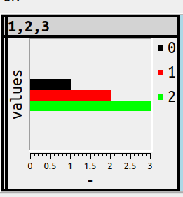
SET ocelot_grid_chart = 'bar vertical';
… since users will know that SET value = literal is the SQL way to assign, and will know that ''s enclose literals, and will know what vertical means. So this is the result and it won’t be surprising:
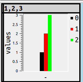
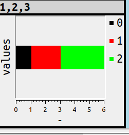
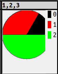
Another bar-chart variant is stacking, that is, putting 3 values in one bar instead of 3 side-by-side bars. For example
SET ocelot_grid_chart = 'bar stacked';
or
SET ocelot_grid_chart = 'bar vertical stacked';
Lines
Lines are a bit less obvious than bars, because if there’s only one number in the series, they’re meaningless. Nevertheless, there should be a simple way to show a chart. Therefore Alt+Shift+L will cause
x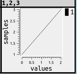
Maybe, although I suppose everyone has seen this sort of thing before, I should make some terminology notes around now …
X-axis: usually this is the horizontal, with the word “samples”
Y-axis: usually this is the vertical, with the word “values”
Legend: in the upper right corner, with a colour icon and a short indicator
Ticks: the tiny marks along the values, so users can see what the scale is.
For the French terms, see Statistique Canada.
But if users don’t know the terms, that’s fine, they understand the picture anyway.
Pies
Pies are obvious and simple too, all they require is
Alt+Shift+P or
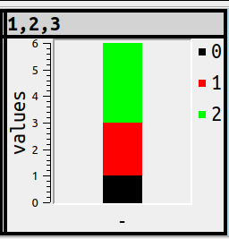
SET ocelot_grid_chart='pie';
and SELECT 1,2,3; will look like this:
Fine. But putting numbers along the x-axis and y-axis wouldn’t be informative, and nobody has figured out what should happen with negative numbers. I think Microsoft Excel would take the absolute value, I think it makes more sense to ignore, but the point is: no solution is intuitive for all, therefore there’s a gotcha, therefore it’s not obvious and simple after all.
Groups
Every illustration so far has been simple, a 3-number series. There’s no complicated decision-making, the algorithm is just “if it’s a number, i.e. any of the data types that the DBMS fits in a general numeric category, it’s in, otherwise it’s out”.
It would follow, then, that
>SELECT 1,2,3,'',4,5,6,'',7,8,9;
would result in this if the setting was for bar charts:
There are three “groups” here, and “groups” is a better word than “series” because GROUP is an SQL-standard term.
Subgroups
Now things get a bit more complex. What makes us decide that every individual numeric-column occurrence should be part of a separate bar or line or pie segment? Answer: nothing does, that’s simple but not really the best for representing some of the typical chart situations.
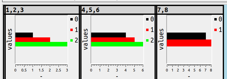
Take the possibility that all the columns which have something in common are combined. The commonness could be the value. For example
SET ocelot_grid_chart='bar vertical subgroup by value % 3';
SELECT 1,2,3,4,5,6,7,8,9,10,11,12,13,14,15;
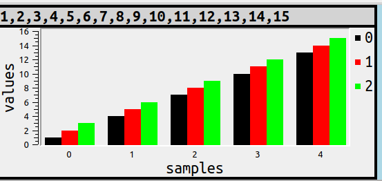
That is, the values which are divisible by 3 are together, but distributed across the landscape. Each of the things that are together are usually called “samples” if one uses chart terminology, and that’s why in this illustration the word “samples” appears at the bottom, and each subgroup has a separate colour, which is echoed by the legend.
More usefully, I think, the commonness could be the column_name prefix. The usefulness lies in the fact that users know how to put AS clauses after column names in the select list, so they can determine what the subgroups are. For example
SET ocelot_grid_chart='bar vertical subgroup by left(column_name, 1)';
SELECT 1 AS x_1, 2 AS y_1, 3 AS z_1, 4 AS x_2, 6 AS y_2, 7 AS z_2;
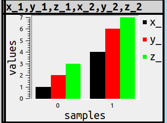
There might be other criteria for deciding how to subgroup, but they’re probably less important. What’s important is that once again the syntax is something any SQL user will understand.
Actually the word that chart-lovers prefer here is “categories”, and “subgroups” isn’t really a word you’ll find in typical SQL, but at the moment I’m thinking it’s “SQL-ish”.
Nulls
Since this is SQL, NULLs exist.
There’s no such thing as obvious when NULL might mean unknown or inapplicable, but this isn’t Oracle so it would be too trite to say NULLs are zeros, at least when it’s possible to hint otherwise. Thus
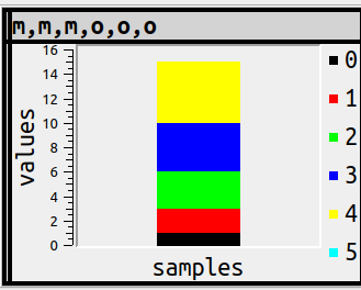
SET ocelot_grid_chart='bar vertical subgroup by left(column_name, 1)';
SELECT 1 AS m, 2 AS m, 3 AS m, 4 AS o, 5 AS o, NULL AS o;
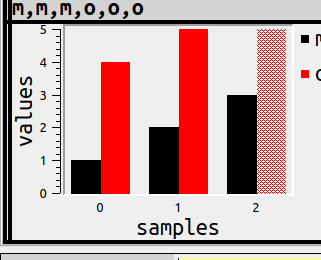
doesn’t use a solid colour, but has the same size as whatever the largest bar is.
I worry that by now we’ve evolved from “obvious” to merely “understandable”, so I’ll explain this example more deeply. In this example there are three samples of ‘m’ and ‘o’. The first sample, label 0, has the first ‘m’ and it has value = 1, the black bar, and it has the first ‘o’ and it has value = 4, the red bar. Sample 1 has the second ‘m’ and the second ‘o’. Sample 2 has the third ‘m’ and ‘o’, and, since the third ‘o’ is NULL, it is not solid. The legend in the right corner is helpful for showing that
black is ‘m’ and red is ‘o’.
WHERE clauses
But surely not every numeric column should always be in a chart? I think of column names that end with ‘_id’, or the possibility that one will want to display both the chart and the numbers as text.
The SQL syntax for deciding what’s in a group could be CASE … WHEN, or IF … THEN, but what even the novice SQL user has seen is WHERE. The condition could be COLUMN_NAME relative-operator value, COLUMN_NUMBER relative-operator value, COLUMN_TYPE relative-operator value. By the way, since this is a GUI, users will see hints for autocompletion when they type WHERE, for example
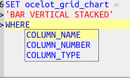
and after
SET ocelot_grid_chart='bar vertical stacked' WHERE column_type = 'integer';
SELECT 1,1.1,2,7,-44;
the result will not include 1.1 in a chart because it is not an integer.
And this is where it becomes possible at last to show the statements that caused the example at the start of this post, where some of the columns were in a bar chart, some in a line chart, and some in a pie.
SET ocelot_grid_chart = 'line' WHERE column_number <= 3;
SET ocelot_grid_chart = 'bar' WHERE column_number >= 4 AND column_number <= 6;
SET ocelot_grid_chart = 'pie' WHERE column_number > 6;
SET ocelot_grid_chart = '' WHERE column_number > 100;
SELECT 0,1,2,3,4,5,6,7,8;
and we’ve arrived at the example we started with.

Turning it off
Alt+Shift+N or
SET ocelot_grid_chart='';will erase all earlier chart statements. So there’s a simple way to go back to the regular way to display results.
Source Code
My main purpose describing all this is to show what the design of a GUI should look like, if my observations about goals make sense.
The illustrations show what the implementation looks like as of today, they’re screenshots of ocelotgui, and they work as I’ve described. But currently they’re only distributed in source code. Anyone who wants to reproduce them today can download the source from github, follow the special build instructions in file chart_options.txt, connect to MySQL or MariaDB or Tarantool, and see the same things. You will notice that you need to use the Qwt library, which should be no problem (ocelotgui is GPLv2, Qwt is LGPL, Qwt is on many distros). Pay no attention to the bug in the room.
But I’m not sure whether to call this the final look for the next executable release. Let me know in the comments if I’m missing tricks.